

Color Matters
When launching a brand, color matters! In fact, color is one of the most important aspects of a brand. It’s not just picking a great color palette that you love, it’s about picking the right combination of colors which will not only give your brand a beautiful aesthetic but also communicates your brand’s personality traits to your audience.
Research shows that 92% of consumers agree visual appearance is the most persuasive marketing factor, while 85% believe color is the biggest motivator in choosing a product. This means it cannot be ignored.
First impressions count, and your brand color is likely the first thing customers are going to see. Colors elicit emotional responses and convey information. Customers immediately and subconsciously form an impression without knowing what your product or brand is about. This helps customers decide whether they want to engage with your brand or not within the first few seconds. This is known as color psychology - the study of how colors affect behaviors and perceptions. Understanding color psychology can be used to your advantage when it comes to marketing and branding. A great brand can be recognized on color alone - like Coca Cola with it’s iconic red, Facebook’s blue, and Google’s mix of red, blue, yellow, and green. These brands’ did not choose their colors by accident - they made these decisions intentionally and it paid off.
Understand The Meaning of Colors
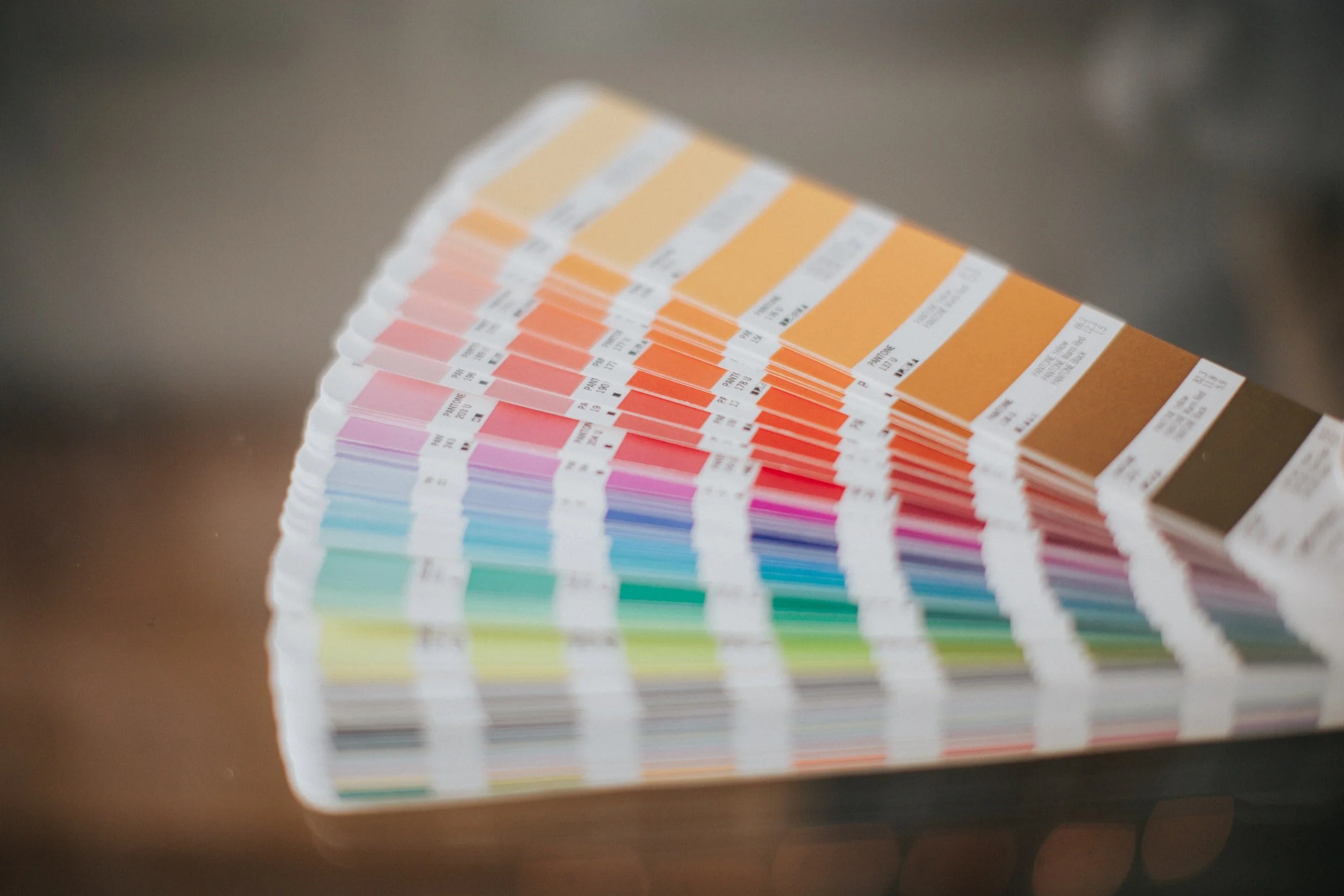
To form a great color palette, you do not have to go down the rabbit hole of color psychology for each and every color. It can easily feel overwhelming. We’re going to give you the basics, but we encourage you to do more research on the specific colors you choose once you have an idea of your perfect palette.
Here’s a basic breakdown of colors to get you started:
❤️ Red is passion and love. It is also associated with danger, energy, and excitement. Can encourage impulse buys and appetite.
🌺 Pink is feminine. It is sentimental but comes in many different shades. Hot pink can be bold and youthful, while softer pinks are romantic and sweet.
🔥 Orange is adventurous, friendly, and confident. It is fresh and creative and is often associated with being cost-effective.
☀️ Yellow is happy and optimistic. Like orange, it is creative and energetic. Yellow is playful and bright like the sun.
🌿 Green is fresh and healthy. It is great for sustainability and growth. It also can convey money, prestige, and fertility.
🌊 Blue is the color of trust and reliability. Blue conveys loyalty and a sense of calm.
🍇 Purple is luxury or royalty. It is spiritual and ambitious and can be mysterious.
🟤 Brown is friendly and natural. It is down-to-earth and often used for organic products.
♛ White is clean and pure. It conveys a minimalist feel and innocence or goodness.
★ Black is dramatic, yet elegant and sophisticated. It is classy and formal, but can also convey sorrow or protection.
🏳️🌈 Multicolor or Rainbow is great for diversity and openness. It conveys unity.
Different hues of these colors also lend input to your color story, but you want to use them in a way that compliments and defines your brand. For example, baby blue can convey a different feeling than turquoise.
Identify your brand personality and essence
Think about the following prior to choosing your color palette:
Brand Goals: Do you want your customers to be more informed, be happy, or get rich?
Target Audience: How do you want them to feel - intelligent, positive or confident?
Personality traits: Is your brand fun, serious, or inspiring?
Figuring out how you want customers to perceive you and your brand can help narrow down your color scheme. For example, you might have a sustainable brand, often associated with green, but your brand essence is about cleanliness and purity, you could choose to go with white. Or, you could use both green and white in your color palette.
Choosing Your Brand’s Color Palette
Most brands have multiple colors. The logo could be teal, but the website and graphics could have blue, brown, or yellow as well. This is your palette, and you want these colors to look good together. You can use a color generator like coolors.co to try different colors next to each other as you work on defining your color scheme. A generator like this will also give you the necessary color codes to put your color palette into action.
It can definitely be overwhelming to choose your colors, so we recommend starting with a palette of three colors - your base, accent, and a neutral. These colors will represent your brand's personality traits and overall feel.
Base color - this is the most important personality trait of your brand and should be the first color you choose for your color palette. Your base color should appeal to your target audience while also representing your brand's most dominant trait. Your other colors will be chosen to match this color, so choose wisely!
Accent color - this color will be used the most often after your base color. Choose a personality trait to represent, while also making two other considerations - your target audience and how this color will pair visually with your base color.
Neutral color - think background. You want this to minimize attention - typically this color is grey, white, or off-white. You want this color to look great with your other colors, but be wary of using shades of black as it can easily overpower other colors in a color scheme.
These are some great guidelines, but there are no hard and fast rules for choosing your branding colors. Always remember to stick to your gut instinct. Your brand should elicit an emotional response from your customers and potential customers, so keep your own feelings top of mind as you develop your brand's color palette.
Need help coming up with a color scheme for your brand? We can help! Send us a message here to set up a free consultation.